
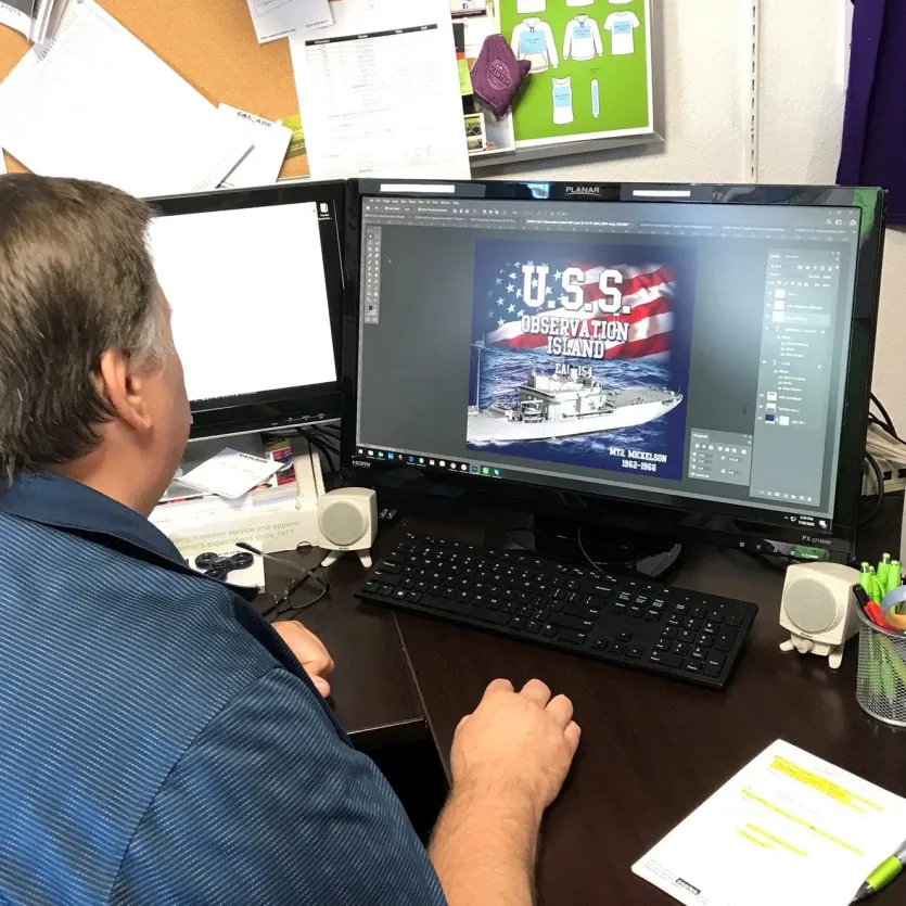
In professional garment decoration, the quality of the final product is decided long before the squeegee hits the mesh. It is decided in the pre-press phase. For many brand owners and graphic designers, the biggest point of friction is understanding that a “good-looking” file on a high-resolution monitor is not necessarily a “press-ready” file for an automatic screen printing machine.
At Northwest Custom Apparel, we see thousands of designs annually. The #1 cause of production delays and unexpected art charges is improperly prepared artwork. This guide establishes the technical bridge between digital creativity and industrial reality, ensuring your brand’s vision is executed with surgical precision.
Why Your Digital File Isn’t “Press-Ready” Yet
When you view a design on a laptop, you are looking at light-emitting pixels in an RGB (Red, Green, Blue) color space. Screen printing, however, is a physical process involving pigment-based inks pushed through a woven mesh.
A “Press-Ready” file must account for:
- Physical Separation: Every color in your design requires its own physical screen.
- Ink Opacity: Standard inks are translucent; they require a “base plate” to appear vibrant on dark fabrics.
- Mechanical Tolerance: Machines have a “registration” limit. If your lines are too thin or your colors are too close without “trapping,” the print will fail.
By mastering the technical requirements below, you move from being a t-shirt designer to an apparel production specialist.
Once your files are finalized to these industrial standards, our production team utilizes them for high-volume custom screen printing shirts to ensure every garment in your order is identical.
The Vector Gold Standard: Why Geometry Beats Pixels
The most critical distinction in screen printing artwork is the difference between Vector and Raster graphics. For logos, typography, and “flat” illustrations, Vector is the undisputed king.
The Physics of Vector Files (.AI, .EPS, .SVG)
Vector graphics are not made of pixels; they are made of mathematical paths—points, lines, and curves. Because these shapes are calculated in real-time by the software (like Adobe Illustrator), they possess infinite scalability.
- Resolution Independence: You can scale a 2-inch vector logo to fit a 40-foot billboard, and the edges will remain perfectly crisp.
- Ease of Separation: In a vector file, a “Red” shape is a distinct mathematical object. Our pre-press team can select that object and instantly assign it to a physical screen.
The “Upsampling” Trap: A common mistake is taking a low-resolution .JPG from a website and saving it as a .PDF or .EPS. This does not create vector art. It simply wraps a “raster” image in a “vector” container. To be true vector art, the design must be reconstructed using paths.
Professional designers typically use industry-standard tools like Adobe Illustrator to ensure vector artwork specifications meet the crisp geometry required for physical mesh exposure.
Mastering Raster Art for High-Detail Printing
While vectors are ideal for logos, Raster art (.PSD, .TIFF) is necessary for photographs, complex paintings, and designs with heavy texture or shading. Raster images are built on a grid of colored squares called pixels.
The 300 DPI Mandate
In screen printing, Resolution is everything. We require a minimum of 300 DPI (Dots Per Inch) at the final print size.
Consider the math:
- If you want a 12-inch wide back print, your digital file must be 3,600 pixels wide (12 inches x 300 DPI).
- If you provide a 72 DPI image (the standard for web viewing), that 12-inch print will appear jagged, blurry, and unprofessional.

High-Impact Screen Printing for Your Brand
Long-lasting and cost-effective, screen printing delivers vibrant results for bulk orders. Perfect for uniforms, promotional shirts, and safety gear.
Discover Screen Printing SolutionsLossless vs. Lossy Formats
Never use JPEGs for high-end production if possible. JPEGs use “lossy” compression, which creates “artifacts”—small blurs around the edges of your design. Instead, provide layered Photoshop (.PSD) files or Tagged Image File Format (.TIFF) files. Layered files allow us to isolate the design from the background, which is essential for printing on anything other than a white t-shirt.
The Science of Color: Spot Colors vs. CMYK
How we translate your digital colors into physical ink is the most technical part of the process. There are three primary methods used in industrial shops.

The Pantone Matching System (PMS)
For 90% of screen printing, we use Spot Colors. We don’t mix colors on the shirt; we mix them in a bucket before they go on the press.
- The Advantage: If your brand uses “Coca-Cola Red,” we use the specific Pantone formula to ensure that red is identical across 5,000 shirts.
- Pre-Press Requirement: Assign your vector shapes to specific Pantone Solid Coated swatches.
Halftones: The Illusion of Gradients
If your design has a fading effect or a shadow, we use Halftones. These are tiny dots of varying sizes. From a distance, the human eye blends these dots into a smooth gradient.
High-mesh screens (230 to 305 threads per inch) are required to hold these tiny dots. If your art has too many fine gradients, it may require a “Simulated Process” approach.
CMYK (Process) vs. Simulated Process
- CMYK: Uses four translucent inks (Cyan, Magenta, Yellow, Black) to create a full spectrum. This works best on White garments only.
- Simulated Process: The professional choice for printing “photographic” images on Black or Navy shirts. It uses a series of opaque spot colors (often 6 to 10 screens) to recreate a full-color image with incredible vibrancy.
To maintain total brand consistency across different global suppliers, we rely on the Pantone Matching System, which provides a universal language for spot color identification.
Technical Prep: Converting Your Vision to Screens
Before a file can be sent to our CTS (Computer-to-Screen) imaging system, it must undergo a final technical sanitization. This is where most amateur designs fail.
Turning Text into Outlines
Even if you provide a PDF or AI file, if we do not have your specific font installed on our pre-press stations, the software will substitute it with a generic font like Arial.
So, Always select your text and use the “Create Outlines” (Adobe Illustrator) or “Convert to Curves” (CorelDRAW) command. This turns your letters into mathematical shapes that remain consistent on every computer in the world.
Stroke Weights and Line Minimums
Ink has physical volume. If your design features lines that are too thin, the ink will physically clog the mesh of the screen, or the line will “blow out” during the screen-burning process.
- The Standard: We recommend a minimum line thickness of 1pt (or 0.014 inches). For negative space (gaps between colors), increase this to 1.5pt to prevent the ink from bleeding together.
The Essential White Underbase
When printing on dark garments (Black, Navy, Forest Green), the fabric fibers naturally soak up ink, making colors look dull or muddy.
We print a White Underbase first. Think of this as a primer on a wall. We then “flash dry” this layer and print your colored inks on top.
Pro Tip: In your artwork file, you don’t need to create this underbase yourself; our pre-press software handles it. However, you should be aware that highly detailed “fades” into a dark shirt color are much harder to achieve with an underbase.
T-Shirt Design Size and Placement Guide

One of the most common queries is: “What size should my design be?” Design size should be determined by the smallest shirt in your order. If you order Small through 3XL, we must size the art so it fits comfortably on the Small.
Standard Industry Dimensions
| Placement | Average Adult Size | Youth (6-12) | Toddler (4T) |
| Full Front | 11″W x 12″H | 9″W x 10″H | 6″W x 6″H |
| Left Chest | 3.5″W x 3.5″H | 2.5″W x 2.5″H | 2″W x 2″H |
| Full Back | 12″W x 14″H | 10″W x 12″H | 7″W x 8″H |
| Sleeve | 3″W x 3″H | 2″W x 2″H | 1.5″W x 1.5″H |
Vertical Placement Rules
- Center Chest: Start the design approximately 3 inches (3 fingers) below the collar for adults.
- Back Design: Start 4 inches below the collar to ensure the design doesn’t sit too high on the neck.
Related Posts You might Enjoy
Industrial Pre-Press at Northwest Custom Apparel
When you submit your screen printing artwork to our Milton, WA facility, it enters a rigorous seven-step industrial workflow designed for maximum efficiency and color accuracy.
- Art Review: Our designers check for resolution, line weight, and font outlines.
- Color Separation: We break your file down into individual monochromatic layers (one for each ink color).
- CTS Imaging: Using direct-to-screen technology, we use lasers or wax to “image” your design directly onto emulsion-coated screens—eliminating the need for old-fashioned film positives.
- Exposure & Washout: The screens are exposed to UV light, hardening the emulsion everywhere except where your design is. We then wash away the soft emulsion, leaving a perfect stencil.
- Press Setup (Registration): Our operators align the screens on an automatic press. This is where “Registration Marks” are vital; they ensure that the red ink hits exactly where the blue ink ends.
- Production Run: We print a “Test Strike” for quality approval before running the full bulk order.
- Curing: Every shirt passes through a conveyor dryer at 320°F to “plastisolize” the ink, ensuring it will never crack or peel.
High-Impact Screen Printing for Your Brand
Long-lasting and cost-effective, screen printing delivers vibrant results for bulk orders. Perfect for uniforms, promotional shirts, and safety gear.
Discover Screen Printing SolutionsFAQs: Screen Printing Artwork
Photos must be converted into Halftones. This process turns the photograph into thousands of tiny dots. For best results, send us the original high-resolution photo, and our art department will handle the halftone conversion to match our specific screen mesh counts.
Yes, but you must export them correctly. From Canva, export as a “PDF Print” and ensure “Flatten PDF” is NOT checked. From Inkscape, save as an .SVG or .EPS to maintain vector paths.
The seven steps are: (1) Art Creation, (2) Screen Preparation, (3) Ink Mixing, (4) Press Setup/Registration, (5) Printing/Squeegee Stroke, (6) Heat Curing, and (7) Quality Control.
Scale your design down to a maximum of 6″ width. Because toddler shirts have very little surface area, avoid Full Front designs that wrap around the sides of the ribs, as this makes the shirt uncomfortable to wear.
Final Technical Checklist for Designers
Before you hit “Send” on your order to Northwest Custom Apparel, verify these five points:
- Format: Is it a Vector (.AI/.EPS) or 300 DPI Raster (.PSD/.TIFF)?
- Fonts: Are all fonts converted to outlines/curves?
- Sizing: Is the art set to the actual physical size you want printed?
- Colors: Have you specified Pantone (PMS) codes for brand-critical colors?
- Background: If using a Raster file, is the background transparent?
By following these industrial standards, you guarantee a faster turnaround and a retail-ready finish. If you’re under a tight deadline, don’t forget to check our rush order t-shirt printing options for 24-hour production.


